This week's BATCH is going to be about:
COVER FAILS
Since I have a minor case of OCD, I find cover problems very annoying. Once you notice that one thing thats wrong on the cover, it just bothers you forever. You glimpse at it, stare at it, wishing it would go away but it stays there, forever. To relieve me of some frustration I'm going to share a couple that I found with you and hopefully make you paranoid about covers for the rest of your life. Enjoy!
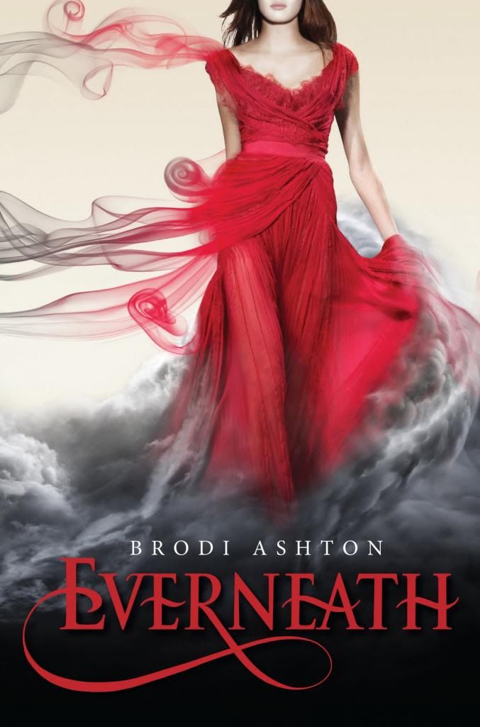
CASE OF COVER FAIL #1:
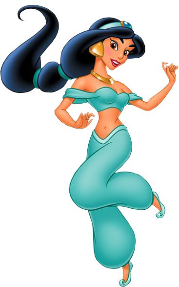
If you look carefully at the legs, you will see that instead of it being flowy like a dress that has smoke should be it has legs crossing over. Now I guess that shouldn't bother me that much but it just doesn't fit with the rest of the cover. Red dress with smoke flowing out, yeah it should be a bit more flowy. But it just doesn't go away. The more you look at it, the more it stands out and soon (if you have some OCD in you) you'll be screaming like a maniac and go crazy whenever you see this cover ever again. Now, is it just me or does this remind of Jasmine's outfit from Aladdin?
CASE OF COVER FAIL #2:
Looks pretty normal right? The dramatic windblown hair and the "symbolic" branches/roots. And then the completely random glowing blue ground (maybe its symbolic as well?). But look again.
What on Earth is she doing with her face?! Its like she's making a weird duck face. Seriously. Her lips are on PUFFED OUT mode. Its not a normal face and I don't know how her facial expression got published into the final copy of the book. The girl herself is actually pretty (though I think its photoshopped) but that face is just wrong. Try not noticing that from now on. >:D
CASE OF COVER FAIL #3:
Now this book is actually technically a cover fail. To be honest, its a pretty obvious one. The cover is intentionally dark with a white dress and inhumanly black skin. Now the cover actually is pretty and gorgeous but after I looked at it for a while, it just kinds of look cheap to me. Like one of those fake color changing things that people do on Instagram. In the book it even SAYS in the book that she is the exact opposite of black. "But you'll still look albino when you let me back..." (page 15, Anna Banks). For a person who is white (skin color, not race) you would kind of expect her to not have charcoal black skin? Is it just me, or is the random dramatic cover just TOO random?
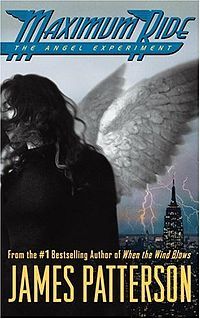
CASE OF COVER FAIL #4:
Maximum Ride: The Angel Experiment cover is actually pretty good. It has angel wings so not random, New York which means they probably go there, and she has freakishly white skin that makes you think she's an experiment. The thing is, you can't tell she's a girl. At least to me I couldn't. I thought she was a guy because 1). The cover shows a multi-gender looking person and 2). The book doesn't say ANYTHING about her being a girl until later. I mean the name Max even sounds like a guy. This also isn't technically a cover fail but next time there will hopefully be someone who can be more recognized as a girl.
Yep! So thats it.
That's all I can think of for now. In case you wanted to know, I just got all of these books from the library and it just happened to be that a lot of them had Cover Fails in them. I enjoy doing Cover Fails and there are already some more books that I find suspicious right now. Hopefully you are now paranoid forever about book covers. :) Hahaha, just kidding. I hope you enjoyed this post!
Super cheesy line coming up...
Are you Being A Thursday Cover Hoard?


No comments:
Post a Comment